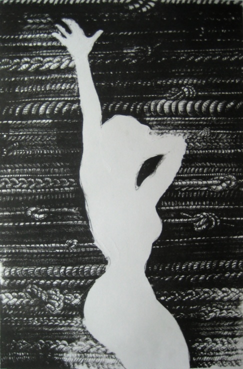
This is the finished version of my second lithography project. After many disasters, I managed to pull four good prints to make an edition. Our assignment was to use a newspaper to inspire our work. What we took from the newspaper, no matter how much or little, was up to us.
I choose to use two pieces from the New York Times to inform my work: an article entitled “Sex Ed in Washington” and a screen cap from the movie “Chicago”. The article is about the issue of sex education in America and whether programs should be locally or nationally regulated. The article takes the stance that the issue should remain a local one because of the differing opinions on sex and its role in public schools from region to region.
I choose to respond to this issue with a pin-up poster—something clearly sexual in nature. Using the screen cap from “Chicago,” I placed the figure in white silhouette in the center of the composition, surrounded by braided and knotted ropes. The knots represent the tension and confusion over the issue, the different kinds of braids, the differing opinions. The ropes are laid next to one another in stripes—like the American flag, or as in the rows of plowed farmland that stretch across the nation.
In the United States, sexuality is fairly accepted and commonplace in the media, making the woman’s figure in the foreground nothing unusual to see. The textured noise in the background is exactly that: background noise. Real-life sex has no effective education system; the nation knows about sex what it sees in the media. The debates about abstinence, abortion, and safe sex are only a concern to the people arguing, and of little consequence to the teenagers and young adults to whom the messages are targeted.
The process:
During assignment II, I had considerable misfortune when gumming my plate. my design called for my to gum my boarders, preventing ink (value) from touching those spots, as well as gumming out the figure so that she would remain completely white. I had to counter etch three times because of gum in areas where it should not have been. (my brush dripped, the sponge dripped, the gum ran, etc.) As a result, while printing, some areas of the image look faded or bleached out because of this gum that I was not able to completely remove. Also, the conte-crayon that I used to draw on the plate before putting anything “permanent” on the surface stained the plate, though I tried to draw lightly, and the unwanted lines showed up in printing inside the white figure. I spent hours trying to remove these lines from the inside of the hand and near the edge of the figure, and was mostly successful, but there are still traces that I could not get out because the lines were so dark and numerous.
In addition, while I was proofing my image for printing, it was rolling up very very slowly and was taking many more than five proofs to move onto good paper. It was suggested to me that I add more shop mix into the ink. After the ink was added, my image started to fill in quickly, and so some parts of the ropes are darker than intended. I received the okay to pull four good prints instead of five because I had already spent so much time at the press during class.
Overall, I think that the image still conveys what it needs to. This piece is mostly about concept, and the image is still strong though more rustic than I originally intended. But that is the nature of print-making I suppose. With such a long and complicated process, things could (and WILL) go wrong at every turn. You never know exactly what your work is going to look like until the very end.

